Blogs
Responsive Web Design: Why It’s Essential for Modern Websites
In today’s digital age, where smartphones, tablets, laptops, and desktops are all part of our daily lives, ensuring that your website looks and functions flawlessly across all these devices is paramount. This is where responsive web design comes into play. Responsive web design is a design approach that allows web pages to adapt and respond to different screen sizes and devices, providing an optimal viewing and interaction experience for users. In this blog post, we’ll explore why responsive web design is essential for modern websites, its key benefits, and best practices for implementation.
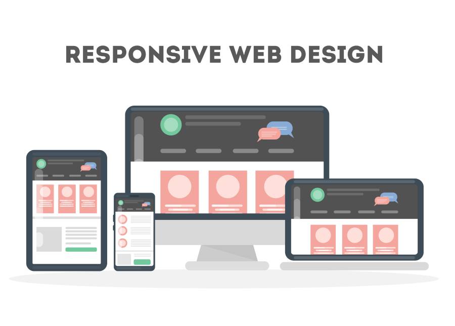
What is Responsive Web Design?
Responsive web design involves creating websites that dynamically adjust their layout and content based on the size and orientation of the user’s device screen. This means that whether someone is accessing your website from a smartphone held vertically, a tablet in landscape mode, or a desktop computer with a large monitor, they will have an optimal viewing experience without having to zoom in or scroll excessively.
Key Benefits of Responsive Web Design
Improved User Experience:
Responsive Web Design for Modern Websites ensures that users can easily navigate and interact with your website regardless of the device they’re using. This leads to higher engagement, lower bounce rates, and increased conversions.
Broader Audience Reach:
With the proliferation of mobile devices, having a responsive website allows you to reach a broader audience. Whether someone is on their smartphone during their commute or browsing on a tablet at home, your website will provide a seamless experience.
Better SEO Performance:
Responsive Web Design for Modern Websites is favored by search engines like Google because it eliminates the need for separate mobile and desktop versions of a website. This means that all of your content resides on a single URL, making it easier for search engines to crawl, index, and rank your site.
Cost and Time Efficiency:
While initially, the development of a responsive website may require more time and resources, in the long run, it’s more cost-effective than maintaining separate desktop and mobile versions. Updates and changes can be made once and applied universally across all devices.
Future-Proofing Your Website:
As new devices with varying screen sizes and resolutions continue to emerge, responsive web design ensures that your website remains compatible and accessible to users, regardless of the devices they’re using now or in the future.
Best Practices for Implementing Responsive Web Design
Use a Mobile-First Approach:
Start by designing your website for mobile devices and then progressively enhance it for larger screens. This ensures that your website prioritizes the mobile user experience, which is becoming increasingly important.
Utilize Fluid Grids and Flexible Images:
Instead of fixed-width layouts, use fluid grids that adapt to the size of the user’s screen. Combine this with flexible images that scale proportionally to prevent distortion and maintain clarity.
Prioritize Content:
Identify the most important content and features of your website and ensure they are prominently displayed and easily accessible on all devices. Consider hiding or reorganizing less critical content for smaller screens.
Optimize Loading Times:
Minimize the use of large images, unnecessary scripts, and bulky elements that can slow down your website’s loading times, especially on mobile devices with slower internet connections.
Test Across Devices and Browsers:
Regularly test your website across a variety of devices, screen sizes, and browsers to ensure a consistent and optimal user experience for all visitors.
In conclusion, responsive web design is not just a trend but a necessity for modern websites. It enables your site to adapt seamlessly to the ever-changing digital landscape, providing users with a consistent and enjoyable experience across all devices. By embracing responsive web design principles and best practices, you can future-proof your website, improve SEO performance, and ultimately, enhance user satisfaction and engagement.
Also Read This: Website Development Trends: Responsive Design and Beyond