Blogs
The Impact of Responsive Web Design on User Experience
In the era of diverse digital devices and varying screen sizes, creating a seamless and user-friendly experience across platforms is no longer a luxury but a necessity. Responsive design has emerged as the solution to this challenge, revolutionizing the way websites are built and accessed. In this in-depth exploration, we’ll delve into the profound impact of responsive design on user experience, examining how this approach enhances accessibility, engagement, and overall satisfaction for online audiences.
Introduction: The Evolution of User Expectations
The proliferation of smartphones, tablets, and a multitude of other devices has fundamentally altered the digital landscape. Users now expect websites to be not only visually appealing but also functional and accessible across a spectrum of screens. Responsive design, as a web development approach, has become a cornerstone in meeting these evolving user expectations.
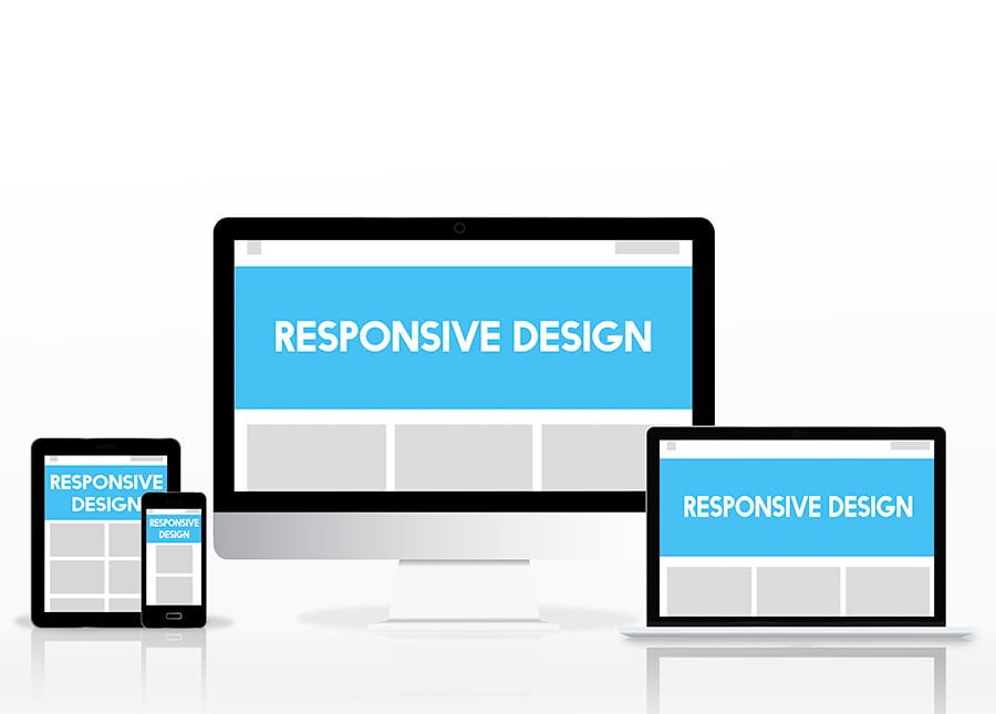
Understanding Responsive Design: A Dynamic Approach to Web Development
- Definition and Principles of Responsive DesignResponsive design is an approach to web development that ensures a website’s layout and content adapt fluidly to the screen size and device type. It employs flexible grids, media queries, and scalable images to create a seamless and consistent user experience regardless of the device being used.
- Fluid Grids and Flexible LayoutsThe use of fluid grids allows elements on a web page to proportionally adjust to different screen sizes. This flexibility ensures that the layout remains visually appealing and functional, whether viewed on a large desktop monitor or a compact smartphone screen.
Enhancing User Experience Through Responsive Design
- Improved Accessibility Across DevicesResponsive design eliminates the need for separate mobile and desktop versions of a website. Users can access the same content and features seamlessly across devices, reducing the frustration associated with inconsistent experiences.
- Enhanced User Engagement and InteractionA responsive website encourages user engagement by providing a consistent and optimized experience. Interactive elements, such as forms and calls-to-action, function smoothly, contributing to increased user interaction and conversion rates.
- Faster Page Load TimesResponsive design often involves optimizing images and resources for different devices, contributing to faster page load times. Improved loading speed is crucial for user satisfaction and positively impacts search engine rankings.
- Google’s Mobile-First IndexingGoogle prioritizes responsive websites in its search rankings, particularly with its mobile-first indexing approach. A responsive design ensures that a website is well-positioned in search results, driving organic traffic and enhancing visibility.
- Adaptability to Future DevicesAs new devices with varying screen sizes and resolutions enter the market, responsive design ensures that a website remains adaptable. This future-proofing approach saves resources by eliminating the need for frequent redesigns to accommodate emerging technologies.
Challenges and Considerations in Responsive Design Implementation
- Complexity in Design and DevelopmentWhile responsive design offers numerous benefits, its implementation can be complex. Designers and developers need to carefully plan and execute the flexible layouts and grid systems to ensure a smooth user experience.
- Prioritizing Content for Different DevicesContent prioritization is crucial in responsive design. Designers must identify key content elements and prioritize their visibility based on screen size, ensuring that users receive the most relevant information first.
Conclusion: Shaping the Future of Web Accessibility
In conclusion, responsive design is not merely a trend but a fundamental shift in the way websites are designed and accessed. By prioritizing user experience across devices, responsive design addresses the diverse needs of today’s digital audience. As the internet landscape continues to evolve, responsive design stands as a foundational element in ensuring web accessibility, engagement, and satisfaction.
Also Read This: THE LOGO DESIGN PROCESS: FROM CONCEPT TO COMPLETION