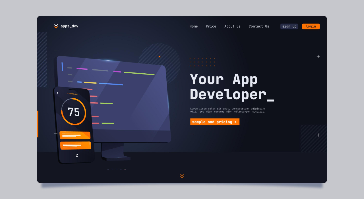
Dark Mode UI Design has gained immense popularity across digital platforms. Initially introduced for better readability in low-light environments, it is now a mainstream design choice. More websites and applications are adopting Dark Theme UI to enhance user experience and reduce eye strain.
With major tech giants adopting dark mode, many businesses see it as essential. But is it a trend or a valuable feature? Let’s explore.
Why Dark Mode UI Design is Gaining Popularity
The increasing demand for Dark Mode UI Design is driven by several factors. First, it enhances visual appeal, giving websites a sleek and modern look. Additionally, users prefer darker interfaces, especially when browsing at night or in dimly lit environments.
Moreover, studies suggest that Dark Theme UI reduces eye strain, improves contrast and enhances battery efficiency on OLED screens.
Key Benefits of Dark Mode UI Design
1. How Dark Mode UI Design Improves User Experience
A well-implemented Dark Theme UI provides a comfortable and visually pleasing experience. By reducing blue light exposure, it minimizes eye fatigue, especially for users who spend extended hours online.
2. Energy Efficiency on OLED Displays
Dark interfaces consume less power on OLED and AMOLED screens. Since pixels in darker areas use minimal energy, significantly improve battery life on mobile devices.
3. Modern and Stylish Aesthetic
Many brands adopt Dark Theme UI to create a premium feel. Dark backgrounds allow vibrant colors, images, and typography to stand out, improving overall website aesthetics.
Challenges of Implementing Dark Mode UI Design
1. Readability and Accessibility Issues
Although Dark Theme UI reduces glare, poorly executed dark designs may cause readability issues. Using the wrong contrast ratios can make text difficult to read, affecting accessibility.
2. Design Inconsistencies
Switching between light and dark themes requires careful design adjustments. Inconsistent color palettes and improper contrasts may affect usability, making less effective.
3. Not Suitable for All Brands
Some brands use bright themes that may not suit dark mode. Businesses should assess brand identity before making the switch.
Best Practices for Implementing Dark Mode UI Design
1. Maintain Proper Contrast Ratios
Ensure that text and background colors have enough contrast; otherwise, readability may suffer. Moreover, low contrast can make content unreadable, ultimately reducing the overall effectiveness of Dark Theme UI.
2. Offer a Toggle Option
Not all users prefer dark mode; therefore, offering an easy switch between light and enhances accessibility and consequently, boosts user satisfaction.
3. Use Dark Mode-Friendly Colors
Avoid pure black backgrounds, as they can strain the eyes. Instead, use dark grays or deep blues to create a visually appealing Dark Theme UI.
The Rise of Dark Interfaces: A Modern Web Design Shift
While Dark Theme UI started as a design trend, it has become a necessity for many websites. As more users expect dark mode options, businesses must adapt to this shift.
However, Dark Mode UI Design should not be implemented just for the sake of following trends. Instead, brands must analyze their audience preferences, industry requirements and website functionality before making the switch.
Conclusion
The adoption of Design is increasing rapidly, primarily driven by user preferences and technological advancements. Moreover, businesses looking to enhance user experience and website aesthetics should, therefore, consider implementing Dark Theme UI strategically.
By following best practices and additionally, ensuring proper readability and offer significant benefits. Whether a trend or a necessity, one thing is clear—dark mode is, without a doubt, here to stay.